Why phone shoppers leave Lebanese product pages without adding to cart, how to measure it, and the fixes that pay back first.
Nearly half the people who visit a Lebanese online shop arrive on a phone, and most of them never press add to cart. Statcounter measured phones at 47.16% of Lebanese web visits for September 2026, and Kissmetrics notes that mobile add-to-cart rates typically run 50 to 60% below desktop.
We build and repair online stores in Lebanon, and the product page is where we find the most fixable losses. The faults are rarely mysterious. A quick-add button sits on top of the product name. A colour grid collapses into a carousel nobody swipes. The delivery fee appears only at checkout. This post covers how to measure the problem, what the first phone screen must show, and what fixing it costs.
Why aren't phone visitors adding to cart?
Phone visitors skip add to cart when the price, the options and the button do not fit on the first screen, or cannot be tapped cleanly. Baymard Institute finds only 38% of mobile ecommerce sites have a decent or good product page, so most stores start from mediocre or worse.
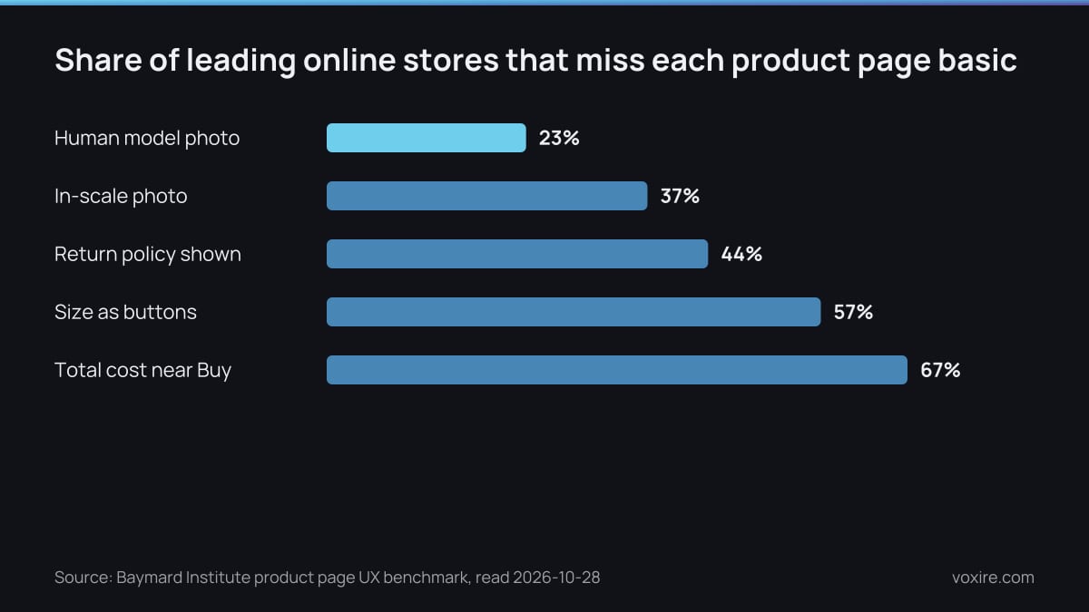
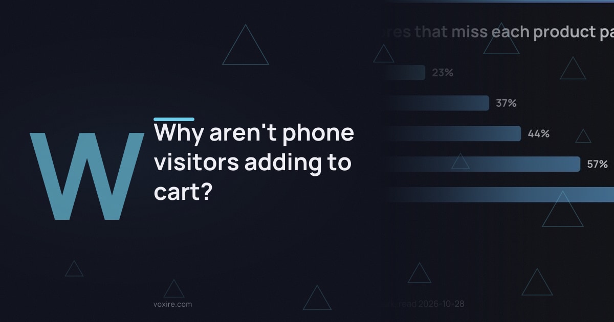
Share of leading sites missing each product page basic. Data from Baymard Institute, read 2026-10-28
Those gaps are measured on large retailers with design teams. Baymard's benchmark finds 57% of sites skip buttons for size selection and 67% give no total cost estimate near the Buy section. Smaller Lebanese stores tend to add their own faults on top. These are the ones we have fixed on client stores this year:
- Quick-add and add-to-cart buttons overlapping product names and prices on small screens.
- Product details hidden under a fixed header or a floating chat button.
- A colour grid that worked on a laptop and turned into a cramped carousel on a phone.
- Product photos that pushed the price and the button below the first screen.
Speed makes every one of these worse. Our audit of Lebanese online stores measured a median Largest Contentful Paint of 9.3 seconds on a phone. A shopper waiting that long for the photo rarely scrolls hunting for the button.
How to calculate add to cart rate?
Add to cart rate is the number of sessions with at least one add to cart, divided by product page sessions, times 100. Kissmetrics gives that formula and a typical range of 5 to 12%, with fashion at 8 to 12% and electronics at 4 to 7%. Split the figure by device before you judge it.
A blended rate hides the phone problem. If your desktop visitors add to cart at a healthy rate and your phone visitors at half of it, the average still looks fine. Most platforms record an add to cart event, and so does a standard analytics setup. Filter it by device and by product, and look at your ten most viewed products first.
Conversion rate is a different number. It counts finished orders, so it mixes the product page with the checkout. Strong add to cart with weak orders points at checkout. Weak add to cart points at the product page. Fix the step that leaks.
What must a product page show on the first phone screen?
The first phone screen must show the photo, the name, the price, the main option and a tappable add to cart button. Apple's design guidelines set 44x44 points as the default control size on iPhone, so a smaller button or swatch invites missed taps and repeated tries.
On a real phone, that screen is short. Every element above the button has to earn its place. The web standard sets a floor too: WCAG 2.2 asks for tap targets of at least 24 by 24 CSS pixels. Treat that as the minimum and Apple's size as the goal. This is the order we build to:
- One photo, cropped tight, with the rest in a swipeable row.
- Name and price, in the currency you charge.
- The delivery fee or free delivery threshold, one line under the price.
- Size and colour as buttons and swatches, never a dropdown.
- The add to cart button, full width, thumb height.
- A sticky add to cart bar once the shopper scrolls past the button.
Nothing should sit on top of that stack. A chat bubble, a cookie bar or a quick-add icon over the price costs more sales than it brings. If you want a WhatsApp button, put it under add to cart and make it quieter.
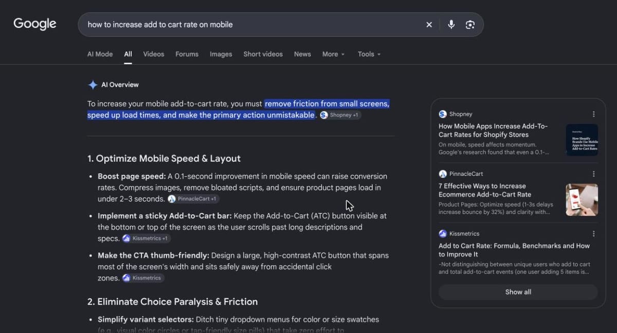
Google results for "how to increase add to cart rate on mobile" searched from Lebanon. Screenshot taken 2026-10-28.
Even Google's own summary for this question leads with the same list. A sticky bar, a thumb-sized button and visible option swatches come before any discount or pop-up.
Do colour and size buttons beat dropdowns on a phone?
Yes: buttons and swatches beat dropdowns, because a dropdown hides the choices behind an extra tap and a scrolling list. Baymard reports that 57% of sites do not use buttons for size selection, although size is one of the most common choices made before buying.
On one fashion client's store, the colour grid showed every shade on a laptop. On a phone it turned into a carousel that hid most colours off screen. Shoppers saw two colours and assumed that was the range. We rebuilt it as a grid of swatches that wraps onto a second row, and switched the carousel off on small screens.
Two smaller rules help. Show sold-out sizes crossed out rather than deleting them, so shoppers do not tap and fail. Change the main photo when a colour is picked, so the choice feels confirmed.
Why are people not completing checkout?
People abandon checkout mostly because of costs they did not expect. Baymard puts the average documented cart abandonment rate at 70.22%, and 40% of abandoners blame extra costs such as shipping, tax and fees. The product page can head that off by showing the full cost early.
Few stores do. Baymard finds 67% of sites give no total order cost estimate near the Buy section. In Lebanon the delivery fee is the missing number, and it often changes by region. Put the fee or the free delivery threshold under the price. Say whether you accept cash on delivery.
Our guides to delivery options for Lebanese stores and how a Lebanese online shop should take payment cover the choices behind those two lines.
Which product page fixes should come first?
Start with the faults most stores share: fix the first phone screen before buying more traffic, then change one thing at a time. That is how add-to-cart rate rises without a bigger ad budget. Kissmetrics lists a prominent button, reviews near it and a sticky mobile bar as the main levers. The table ranks the faults we check first, by how common they are.
| Product page fault | Share of sites with it | Why it hurts more in Lebanon | Fix |
|---|---|---|---|
| Mediocre or worse mobile product page | 62% of mobile sites | Close to half of all visits are on a phone | Rebuild the product template for small screens |
| No total cost near the Buy button | 67% | Delivery fees change by region | Fee or threshold under the price |
| Size chosen from a dropdown | 57% | Sizing differs by brand, so shoppers ask on WhatsApp | Size buttons with a size guide link |
| No return policy on the product page | 44% | Shoppers hesitate before paying online | One line under the button, linked |
| No in-scale photo | 37% | Imported goods vary in size | One photo in hand or on a person |
Source: Baymard Institute, product page UX benchmark, Statcounter, Lebanon device share, read 2026-10-28
Want these fixes priced for your store? Get a free quote.
Work down the table in order. Measure each change for at least two full weeks, by device, before you start the next. A change that lifts the phone rate and leaves desktop flat is the one you wanted. For the rest of the funnel, see our conversion rate optimization guide for Lebanese stores.
Should you fix the product page or rebuild the store?
Fix the product page first: it is usually theme work on one template, while a full rebuild from us costs $5,000 to $12,000. We price the fix after testing your store on a phone. That rebuild range is the one published on our web design service page. One template renders every product, so one fix reaches the whole catalogue.
The template matters more than the platform. The same faults show up on Shopify, WooCommerce and custom builds. What changes the price is how far the theme fights you. A theme with clean product sections takes a few days. A theme that piles apps on top of each other is often cheaper to replace than to patch.
Before you pay for any rebuild, read our answer on Shopify for Lebanese stores, which compares its plans with local payment options.
What should you actually do this week?
Open your own store on your phone, over mobile data, and try to buy your best seller. Statcounter's 47.16% mobile share for Lebanon means close to half your visitors see exactly this view. Write down every moment you hesitate, squint or tap twice.
- Pull add to cart rate by device for your ten most viewed products.
- On a phone, check that price, options and button fit the first screen.
- Move anything that covers the price or the button.
- Replace size and colour dropdowns with buttons and swatches.
- Add the delivery fee or free delivery threshold under the price.
That list is the brief for whoever fixes your theme. It also tells you whether you need a fix or a rebuild.
Sources
- Baymard Institute, Product page UX best practices and benchmark, read 2026-10-28
- Baymard Institute, Cart abandonment rate statistics, read 2026-10-28
- Kissmetrics, Add to cart rate formula and benchmarks, read 2026-10-28
- Statcounter, Desktop vs Mobile vs Tablet market share in Lebanon, read 2026-10-28
- Apple Human Interface Guidelines, Accessibility, read 2026-10-28
- W3C, Understanding WCAG 2.2 Success Criterion 2.5.8: Target Size (Minimum), read 2026-10-28
Want your product page tested on a real phone?
Send us one product link from your store. We will open it on a phone over mobile data, list every fault between the photo and the add to cart button, and quote the template fix or the rebuild, whichever is cheaper for you.
→ E-commerce Development → Get a Free Quote → Chat on WhatsApp
Enjoying this article?
Enter your email and get a clean, formatted PDF of this article: free, no spam.
Voxire
Web Development in Lebanon
Production web development for Lebanese businesses. Next.js and React builds, e-commerce, custom applications, bilingual Arabic and English from the first wireframe, USD pricing with fixed scope, and honest numbers on what a build costs here.
Learn more