Your printed menu was designed for a table, while your ordering menu is read one-handed on a phone, so categories, rows, photos and AI images all change.
Your ordering site is ready for content, and the fastest move is to paste in the printed menu. The second fastest is to fill the photo gaps with AI. Both shortcuts cost orders. DoorDash reports that 87% of consumers have chosen what to eat on a delivery app because of an appealing photo, so on a phone the layout and the pictures do the selling your waiter used to do.
This is how we design ordering menus for Lebanese restaurants and food brands on Voxire's e-commerce team: what a phone needs that paper never did, which dishes earn a photo first, and where AI images cross a line.
How can I design a menu for my restaurant?
Design two menus: a paper one for the table and a phone one for ordering. The paper menu is read slowly, with both hands, in good light. The phone menu is read in a queue or a parked car, usually with one thumb. Every extra scroll there is a chance to close the tab and open Toters instead.
Paper menus spread sections side by side, use decorative dividers and trust the reader to scan. A phone gives you one narrow column. When we rebuilt a Lebanese food brand's menu this year, the printed design was made for a spread. On the phone it became a single column with a pinned category bar, and on desktop a two-pane layout. After the first test on real phones we made the descriptions and the order button bigger. Nobody had noticed the problem on paper.
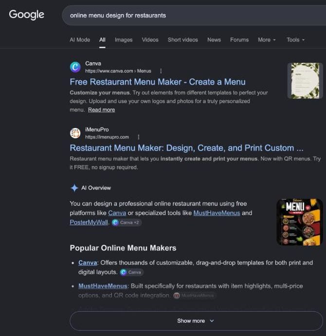
Google results for 'online menu design for restaurants', searched from Lebanon on 2026-11-02. Page one is print and QR menu makers. None of them designs for ordering on a phone.
How should menu categories work on a phone?
Keep the categories pinned where a thumb can reach them, visible the whole time the customer scrolls. In Steven Hoober's 1,333 street observations of phone use, 49% of people touching the screen held the phone in one hand, 36% cradled it and 15% used both hands. Design for the single thumb.
A sticky category rail at the top works when it stays thin and opaque. Nielsen Norman Group's research on sticky headers warns that they take screen space, which matters most on a phone, and that translucent headers make the content beneath hard to read. Our rule is one line of category names that scrolls sideways and highlights the section you are in. On small screens we add a bottom tab bar for the three places people jump to: menu, cart and branches.
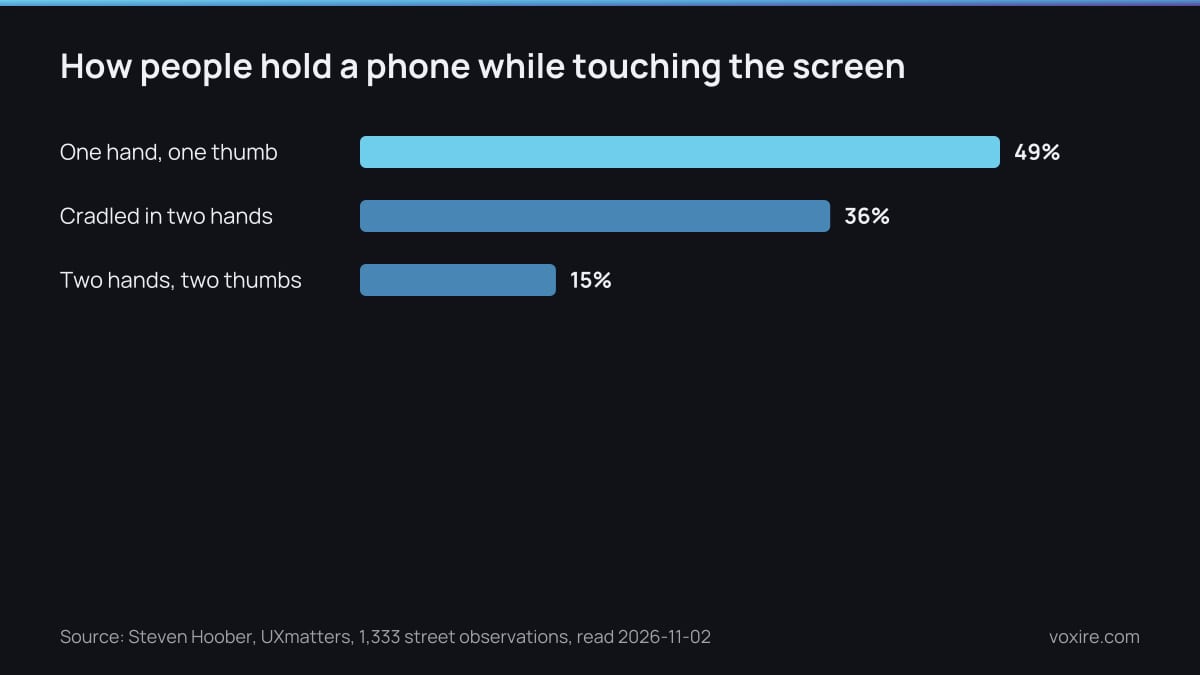
How people hold a phone while using it, from Steven Hoober's study on UXmatters. Half of them have one thumb free for your menu.
What should one menu row show?
One row needs the dish name, a one or two line description, the price, and an add button big enough for a thumb. Anything else belongs on the dish page. Apple's guidelines say a button needs a hit region of at least 44x44 pt, and a tiny plus sign in the corner fails that test.
Descriptions are not filler. DoorDash found that adding descriptions to at least half the menu can increase sales by over 6% on average, and 93% of consumers in its trends report had picked an item because of a detailed description. Name the key ingredients, the portion and any allergen in two lines. Two Lebanese details matter here. Put an Arabic and English switch at the top instead of stacking both languages in every row, which doubles the scroll. And show the price in the currency the checkout will actually charge.
| Menu element | Paper menu habit | Phone ordering menu |
|---|---|---|
| Sections | Side by side on a spread | One column, category rail pinned at the top |
| Navigation | The reader scans | Bottom tab bar within thumb reach |
| Dish row | Name, long description, price | Name, two-line description, price, add button of at least 44x44 pt |
| Descriptions | Optional flourish | On at least half the menu, tied to a 6% average sales lift |
| Photos | A few hero shots | Bestsellers first, toward 50% coverage, tied to a 13% average sales lift |
| Languages | Both on the same page | One switch at the top, one language per row |
| Ordering | The waiter | An add button on every row, cart always one tap away |
Source: DoorDash Merchant learning center, Apple Human Interface Guidelines, UXmatters, read 2026-11-02
Does every dish on an online menu need a photo?
No: photograph your bestsellers first and work toward half the menu, which is where DoorDash measures the gain. On its platform, reaching at least 50% photo coverage can increase sales by 13% on average, and DoorDash tells merchants with gaps to start with their bestselling items.
A first shoot does not need the whole menu. DoorDash's own free photoshoot covers up to 20 menu items plus a header shot, which is a sensible size for a first session. Shoot every dish on the same plate and from the same angle. A consistent set sells harder than a mixed one, because the menu reads as one kitchen.
Can you use AI-generated food photos on your menu?
Use AI to clean up a photo of the real dish, never to invent the dish. A generated image shows food your kitchen did not make, and the customer compares it with the box that arrives. The gap between the picture and the plate becomes a refund, a complaint or a one-star review.
The failure is already public. In 2023, PetaPixel reported AI-looking images on Uber Eats that turned a New York pizzeria's 'pie' into a fruit pie and invented a ranch dressing brand. Uber said it does not use AI to add images to the app, and the owner said he never approved them. Since 2025, Uber Eats offers merchants AI-enhanced food photos, and Engadget noted the tool creates parts of the image that were not there before.
Editing is a different act. DoorDash's tools retouch the lighting, remove the background and replate a phone photo of the real dish. That keeps the food honest. In Lebanon, the Ministry of Economy enforces Consumer Protection Law 659/2005, notably Article 11 on misleading advertising. We are not lawyers, but a photo of a dish you do not serve is hard to defend as anything else. We have used generated food images on a build ourselves, as stand-ins while real photography was pending. That is where they belong: in the draft, then replaced before anyone orders from them.
Can I create a restaurant menu online?
Yes, by four routes: a delivery app listing, a menu builder with a QR code, a PDF behind a QR code, or your own ordering page. Only your own page gives you every customer's number and full control of the design above. Most Lebanese restaurants end up running two of them side by side.
- Delivery apps such as Toters and Talabat bring demand, but the menu follows their template and the customer relationship stays with them.
- Menu builders like the ones on page one of Google are quick and cheap, and fine for a cafe with twenty items.
- A PDF behind a QR code is the paper menu on a small screen: pinch, zoom, scroll, then call to order. We covered the alternatives in our guide to digital menus and QR ordering.
- Your own ordering page costs more and pays back in direct orders without commission. Our online ordering setup guide walks through it.
In our published pricing, a Voxire e-commerce build costs $5,000 to $12,000, depending on catalogue size, branches and integrations. If the menu also has to run the kitchen, stock and branches, that is the job of RTYLR, the restaurant platform we built. Before you build anything, read the seven mistakes Lebanese restaurants make with online ordering.
What should you actually do this week?
Spend one hour on your own menu, on your own phone, with one hand. Most problems show up in the first two minutes: a category bar that scrolls away, a plus sign too small to hit, a dish with no description. Then fix them in this order.
- Time how long it takes to add your bestseller to the cart, one-handed.
- List your ten best sellers and book a shoot for those dishes first.
- Write a two-line description for every dish that has none.
- Take down any generated image of a dish you do not serve exactly as shown.
- Check that every add button is at least a thumb wide.
Sources
- DoorDash Merchant learning center: How Menu Quality Helps You Become a DoorDash Most Loved Store, read 2026-11-02
- Steven Hoober, How Do Users Really Hold Mobile Devices?, UXmatters, read 2026-11-02
- Nielsen Norman Group: Sticky Headers, five ways to make them better, read 2026-11-02
- Apple Human Interface Guidelines: Buttons, read 2026-11-02
- PetaPixel: Uber Eats Allegedly AI-Generating Images of Food, read 2026-11-02
- Engadget: Uber Eats is stuffing AI slop into your meal, read 2026-11-02
- Lebanese Ministry of Economy and Trade: announcement on promotional advertising under Law 659/2005, read 2026-11-02
Enjoying this article?
Enter your email and get a clean, formatted PDF of this article: free, no spam.
Not sure your menu works on a phone?
Send us the link to your current ordering page or a photo of your printed menu. We will show you where a one-handed customer gets stuck, which dishes to photograph first, and what a proper phone menu would cost.
→ E-commerce Development → Get a Free Quote → Chat on WhatsApp
Voxire
Web for Hospitality
Websites and digital systems for restaurants, hotels, and hospitality in Lebanon and MENA. Online ordering, reservations, POS integration, direct booking that beats OTA commission, and the local search work that fills tables.
Learn more