Good UI and UX design for Lebanese websites means building sites that convert, not just sites that look good. Here are the principles, mistakes, and 2026 design trends that determine whether a Lebanese website generates business or just collects traffic.
The short answer
Good UI and UX design for Lebanese websites in 2026 means building sites that convert visitors into customers, not just look good in a Behance mockup. The principles are the same as any market: clear hierarchy, fast load times, and a mobile experience that does not force users to pinch and zoom. The execution, however, needs to account for Lebanese user behavior, Arabic-English bilingual needs, and the specific trust signals Lebanese consumers respond to before they contact a business.
What is the difference between UI and UX design for a Lebanese website?
These terms are often confused - and in Lebanon, even more often misquoted in agency proposals.
UX (User Experience) design is the architecture of how a website works: the user journey from landing to conversion, information hierarchy, navigation logic, and the removal of friction at every step. UX is invisible when it works well - users just find what they need and take the action you want them to take.
UI (User Interface) design is how the website looks: typography, color, spacing, component design, and visual consistency. UI is what users notice first. A beautiful UI on a bad UX is like a stunning restaurant with a confusing menu - guests leave without ordering.
For Lebanese websites, the most common failure is the reverse: reasonable visual design on a broken user experience. Sites that are beautiful on desktop and unusable on mobile. Sites with Arabic content that breaks the English layout. Sites that look professional but have no clear primary call to action above the fold.
What makes UX design work for Lebanese audiences specifically?
Lebanese users browse in a hybrid mode uncommon in other markets. Arabic and English are used interchangeably within the same session - often within the same page. A Lebanese visitor will read an English headline, switch to Arabic for the product description, and fill out a form in English. This bilingual behavior has direct implications for UX design:
- Navigation labels should be tested in both languages - some words are shorter in Arabic and others in English, which affects button sizing and layout width
- If you have a bilingual site, language switching must be visible within the first viewport, not buried in a footer
- Right-to-left (RTL) layouts for Arabic content require a complete CSS rethink, not just a text-direction flip
Beyond bilingual needs, Lebanese users have high expectations for mobile performance. Lebanon has a mobile-first internet culture, driven by years of desktop infrastructure challenges. If your website takes more than 3 seconds to load on a Lebanese mobile network, you have already lost 40-60% of your visitors. The website speed and Core Web Vitals guide for Lebanon covers the technical fixes in detail. See also: B2B Website Design in Lebanon for the topic-specific playbook.
Trust signals matter more in Lebanon than in many markets. Lebanese consumers are skeptical of new businesses online - for understandable reasons given the economic environment. Your UX design must prioritize:
- Real phone numbers and WhatsApp buttons above the fold
- Physical address or city reference (even just "Beirut-based" helps)
- Real testimonials with names, photos, and specific outcomes - not generic five-star ratings
- A visible team or founder section - anonymous businesses convert at a fraction of the rate of ones with a human face
What are the UX mistakes that most Lebanese websites make?
Based on audits of Lebanese business websites, the five most damaging UX mistakes are:
- No clear primary CTA above the fold: visitors arrive and do not know what action to take. Put one button above the fold - not three, one.
- Mobile navigation that covers content: hamburger menus that open full-screen and obscure everything confuse Lebanese mobile users, who expect a simple dropdown or slide-in drawer.
- Forms with too many fields: every field you add to a form costs you conversions. Lebanese users are particularly likely to abandon multi-step or long forms. Start with name, phone, and message.
- No WhatsApp integration: the absence of a WhatsApp contact option is a significant trust and usability failure in Lebanon. WhatsApp is the default communication channel for Lebanese consumers dealing with businesses.
- Hero sections with no immediate clarity: a large background video that looks impressive but does not immediately answer "what does this company do?" is a conversion killer. State your value proposition within the first two seconds of visual attention.
As the what makes a website actually convert guide explains, the most effective Lebanese business websites are not the most visually complex ones - they are the ones that make the next step obvious.
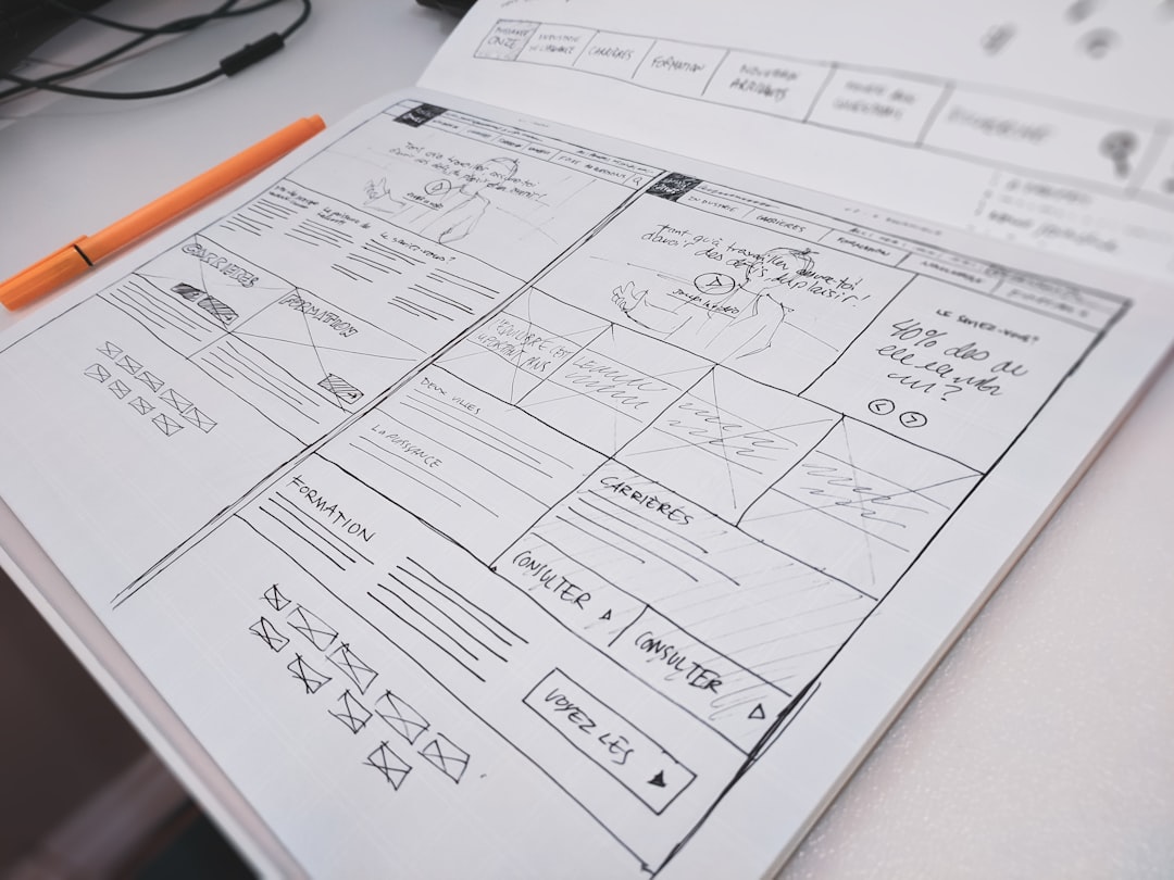
What should a UI/UX design brief for a Lebanese website include?
If you are commissioning a new website or a redesign, your brief should specify:
- Primary conversion goal: what is the one action you want visitors to take? (Book a call, send a WhatsApp, fill out a form, add to cart)
- Primary device: what percentage of your visitors are on mobile? For most Lebanese businesses it is 65-80%
- Language requirements: English only, Arabic only, or bilingual with RTL support
- Key trust signals: what credentials, testimonials, or client logos must appear?
- Brand guidelines: fonts, colors, and visual style (or ask the agency to define these if you do not have them yet)
- Competitive reference sites: which websites in your industry do you admire and why?
The difference between using a website builder vs a professional web designer in Lebanon often comes down to whether the brief above is taken seriously. Builders apply generic templates. Professional UX design starts with your conversion goal and works backward from there.
What are the UI design trends driving Lebanese website design in 2026?
The visual trends that dominate Lebanese web design in 2026 reflect global directions with local adaptations:
Dark mode as default: dark backgrounds with light text and brand-color accents are the dominant aesthetic for tech, agency, and upscale brand sites in Lebanon. Users associate dark interfaces with premium quality.
Micro-interactions: hover states, button animations, and subtle form feedback that confirm a user's action. These small details significantly increase perceived quality and user confidence.
Minimal, typographic-led layouts: the trend away from image-heavy pages toward strong typography and whitespace. This also loads faster, which directly improves Core Web Vitals scores.
Glassmorphism and gradient accents: semi-transparent card backgrounds and brand-gradient text elements used sparingly. The key word is sparingly - overuse looks dated within 12 months.
AI-generated illustration as texture: generative AI visuals used as subtle background texture or section dividers, not as primary content images. This replaces generic stock photography that Lebanese users have learned to ignore.
Need a website or web app built in Lebanon?
Voxire designs and builds Lebanese websites that convert - mobile-first, fast, and built for the way Lebanese users actually browse. From UX strategy to UI design to full-stack development, we own the entire process under one roof in Beirut.
→ See our UI/UX design → Get a Free Quote → Chat on WhatsApp
Enjoying this article?
Enter your email and get a clean, formatted PDF of this article - free, no spam.
Voxire
Web Development Services
We build fast, SEO-optimized websites and web apps for businesses in Lebanon and the Middle East.
Learn more